Samsung Moment – Sprint (Review)
The Hardware – 4/5 stars
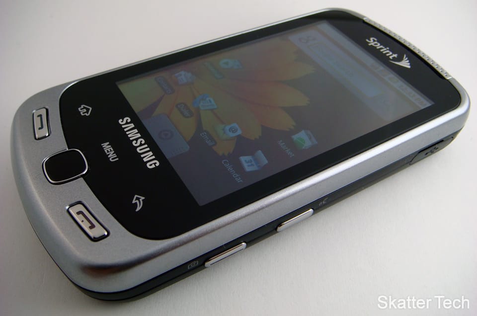
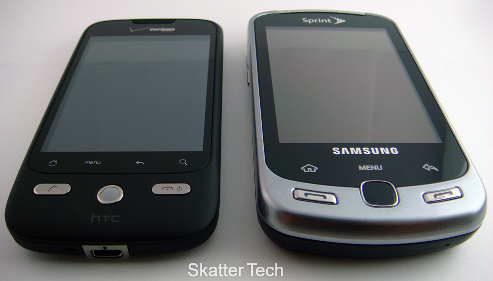
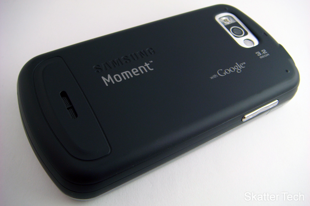
I was quite interested with the Samsung Moment since I first noticed the large display and the physical slide-out keyboard when it was announced. Initially it does appear to be bulky, but once you get handle it for a bit, it’s not too bad. It’s actually not that bulky and relatively light weight too (5.67 oz.) The Moment is coated with a metallic chrome finish that complements the black trim well. Sliding the phone’s keyboard out feels solid, however it is a bit flimsy when slid-out. The two different pieces wiggle slightly. I’m not sure if it was just my unit, but other slide out devices such as the Motorola Droid didn’t have this issue. On the front face you’ll find a physical Call and End button. There’s also the Home, Menu, and Back keys right above a touch pad. It’s a well appreciated alternative to the trackball found on BlackBerry and HTC devices. The optical joystick registers your finger’s touch just like a regular touch pad. I found it worked well and at times more preferable to use than the touch screen. There is a dedicated button on the right side of the phone that brings up voice recognition as well as the camera. On the left side there’s a volume rocker. I was glad to see a standard 3.5mm headphone jack at the top and a flash included with the camera on back. Overall, the phone is definitely a bit larger than other smart phones, but won’t make much of a difference when carrying it around.

The Display – 3/5 stars
The touch display on the Samsung Moment is a 3.2″ AMOLED (320 x 480) wide-screen. When I first used it, it looks just fine. It’s a bit recessed into the phone’s frame, but isn’t an issue. However, once you compare the display to an iPhone or HTC Hero, you’ll be in shock. The colors on the Moment has a blue tint to it while other phones seem to have much warmer colors. It’s still better looking than the display on Sprint’s most expensive device, the HTC Touch Pro2. The screen was slightly lacking in terms of responsiveness. I often had to flick panels or items slower deliberately for it to detect my command properly. The Android OS interface seems to run a bit smoother (less choppy) on the HTC Hero and the Droid Eris. I don’t know if I can attribute that to a display issue, a software bug, or a processor lacking, but it’s there. To sum things up, the screen just doesn’t have that vibrant spark that you sense when you first look at other cell phone displays.
Slide-Out Keyboard – 4/5 stars
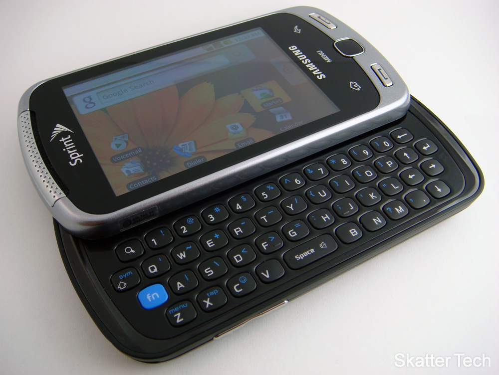
Don’t get me wrong, I love my touch-screen device these days, but I often become frustrated with its shortcomings. I sometimes do yearn for the original speed and feel of that physical keyboard. On the Moment I was pretty satisfied with how texting played out on my fingers. The keys are for the most part well mapped out and placed. It did at first take me a while to get used to the bottom row of keys which were positioned slightly to the left. It doesn’t pose much of a problem but you’ll have to tuck your thumb if you need to hit the ‘Z’ or ‘X’ buttons. The keys are well-sized and offer a bit of an edge over a touch-screen keyboard that sometimes won’t register your keystrokes properly. Plus it’s easier to have the physical feel when multitasking and can’t keep your eye on the device at all times.

Camera & Camcorder – 3/5 stars
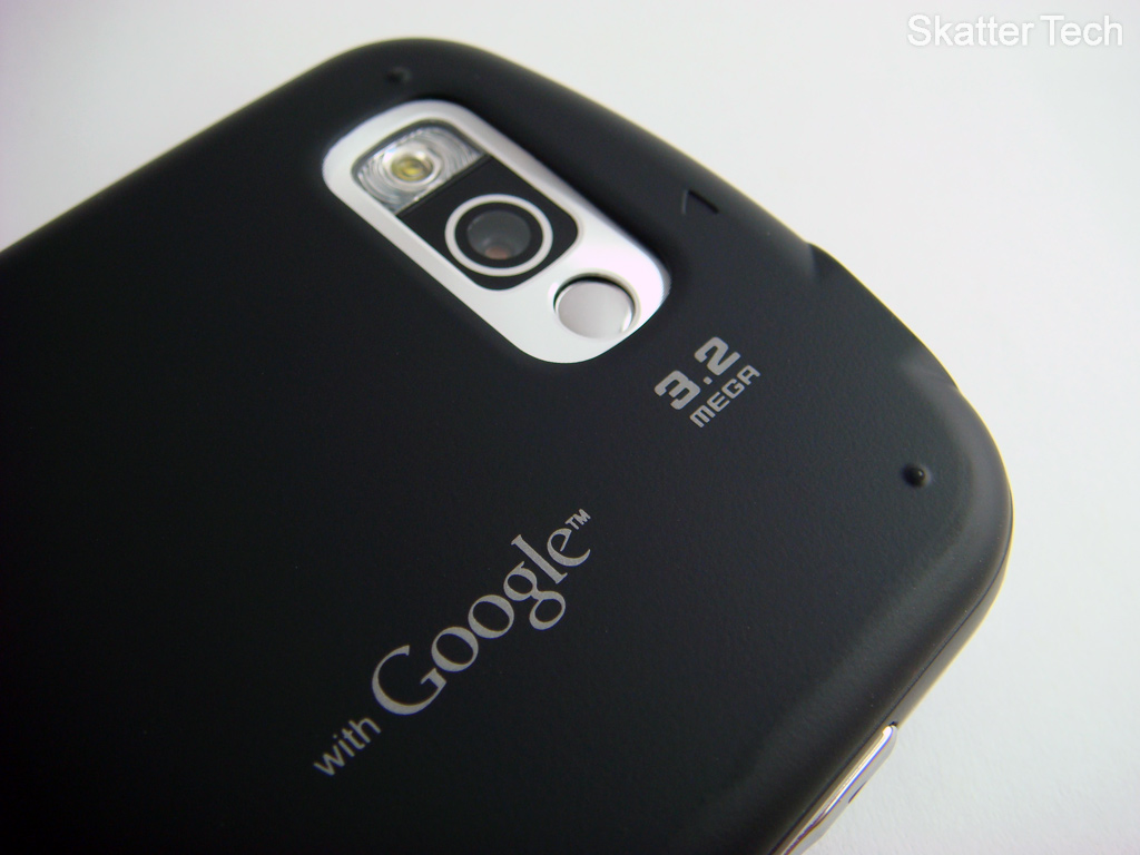
Something that was left out and that I was longing for with my current phone is a camera with flash to complement it. To that end, the Samsung Moment does oust my HTC Hero. The Samsung moment sports a 3.2 megapixel camera with auto-focus. I took some outdoor shots with the Moment and the iPhone 3GS. The Moment resulted with brighter images, but the colors were slightly washed out. While the colors weren’t as rich as with the iPhone 3GS, it still looked better overall. Unfortunately the viewfinder isn’t as snappy as the iPhone. When held side by side and panning in different directions, the Moment was clearly a fraction of a second behind. The inclusion of the flash definitely does help with dark shots. The largest problem comes in with the software. It lacks any custom settings or features. The only available options are to enable geo-tagging, choose Hi or Low for Video Quality, and enable Flash. There’s not even an auto setting for the Flash. There’s no custom resolutions for images either. Even cheap camera phones offer some special effects and settings, this phone doesn’t. I should not that, it does allow sharing images with web services, email and MMS. There’s also an image crop feature built in. Overall, there’s still a lot of room for improvement for Samsung to do with a future iteration of this phone.
Music, Media and Syncing – 3.5/5 stars
Music playback through the phone’s speakers as well as the standard 3.55mm audio jack both sound great. The jack is protected with a plastic cap cover which I found to be a bit annoying and cheap-looking, nonetheless it’s there. Especially seems like a small complaint, when they finally adopted a standard earphone jack. The Music app that comes with the Moment is fairly basic. There’s no fancy album cover flow features as found on phones like the HTC Hero/Eris. Graphic layout aside, it is easy to navigate through, browsing by albums, artist, and songs. There’s also the standard play all or shuffle all option. Music on the Moment functions well enough and audio quality comes in at an enjoyable level. Being that it is an Android OS phone you have the option of downloading more enticing music apps and services such as Shazam, Pandora, and Last.fm.
User Interface – 3/5 stars
Perhaps I came into this review with the expectation bar set too high , but after using the Samsung Moment‘s interface for a few days I began to appreciate the interface on my HTC Hero more. The Sense UI that HTC has customized Android is truly marvelous. On the other hand, the default interface on the Moment is quite bland. The only extra custom widgets are from Sprint and aren’t exactly too attractive. Some even look like 8-bit Nintendo era icons. Well maybe not that bad, but you get my point. There’s just not that WOW factor. That being said the phone does come with some extras. These include an Instant Messaging, Nascar Sprint Cup, NFL Mobile Live, Sprint Navigation, Sprint TV, and a few more. This aspect is quite neat since other Android devices from competing providers don’t include these features by default. I also did all my data syncing with Google this time around. I was able to instantly pull in my Calendar, Contacts, and Email from the ‘cloud’. The Google features worked smoothly.
Battery Life – 3/5 stars
Just like with my current HTC Hero I feel that the Moment is a bit pressed on battery life. The projected 5.5 hours of continuous talk time is a bit ambitious. I felt as though I reached a lot for the charger through my day-to-day tests. I would recommend having most services turned off when not in use (GPS, WiFi, Bluetooth). This will just mean not checking your email and Facebook updates as often throughout your day. Additionally, I would consider the option of investing a little money in a portable external battery to take with you if you do run a little low on juice. That being said, most smart phones are known for their horrible battery life. The Moment isn’t an exception. Even the famous iPhone 3GS gets rendered useless in no time.
Bottom Line
My initial reaction to the Samsung Moment was definitely positive curiosity. After spending time over my week with it, to be quite honest there were definitely some shortcomings. None that would at all impede the average user who just needs a little bit more control over the features of their phone. The physical keyboard adds a nice functional flair to the phone and will be likely appealing to the heavy texting crowd. I know I voiced my complaint over the interface to be bit a little bit lacking as well as the battery life, but when it works, it does just about everything you want it to do. The display’s colors was a bit odd to get used too, but if you don’t have another device to compare it with, you won’t notice. The Samsung Moment comes packaged with Micro-USB charger, Headphones, and Micro-USB transfer cable and documentation. I would have to say that the Moment is a mid-range Android phone. It certainty isn’t as well designed as the Sprint HTC Hero. Even the Palm Pre offers a lot more for nearly the same price. Speaking of cost, the Samsung Moment will run you about $179 with a new 2-year agreement after a $100 mail-in-rebate.
DEAL: Samsung Moment for $80
Links: Sprint.com Samsung Moment