In Photos: Marvel v Capcom 3
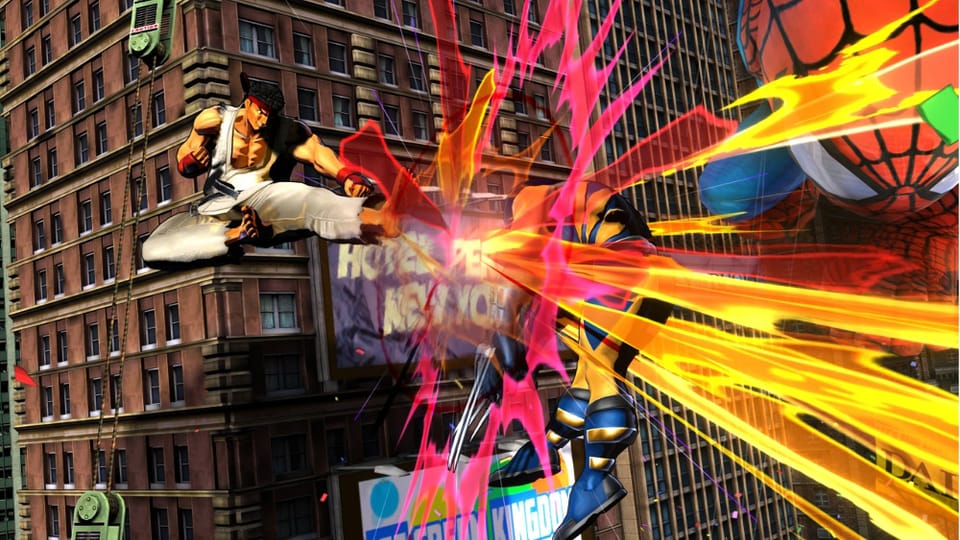
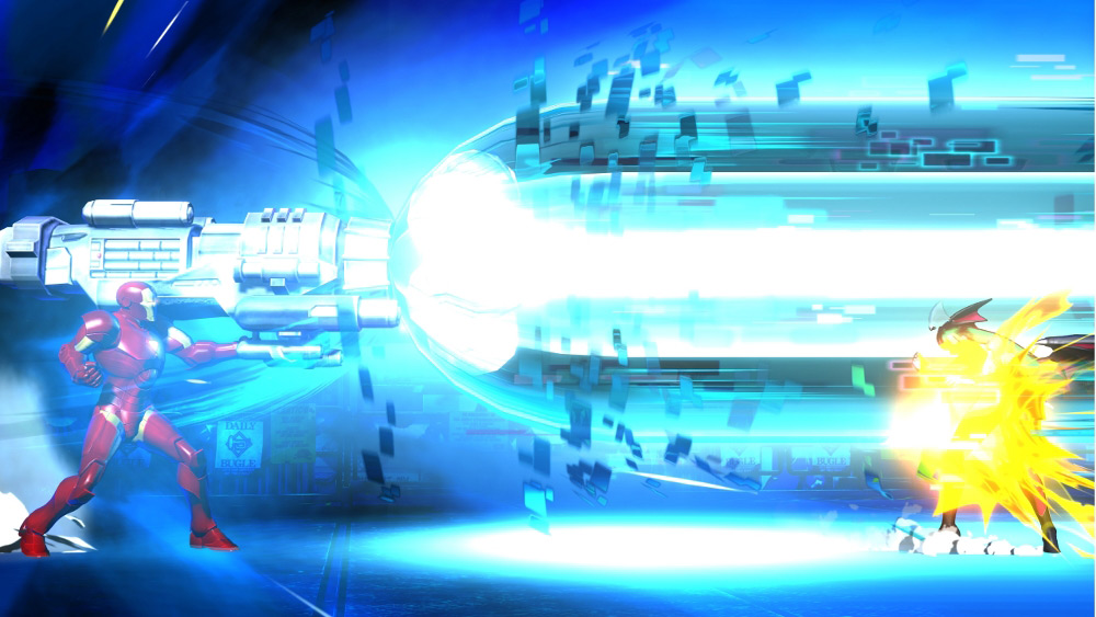
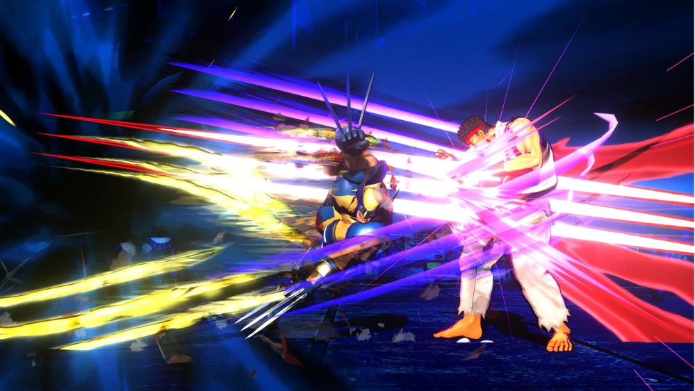
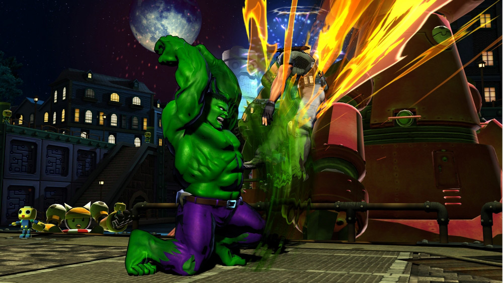
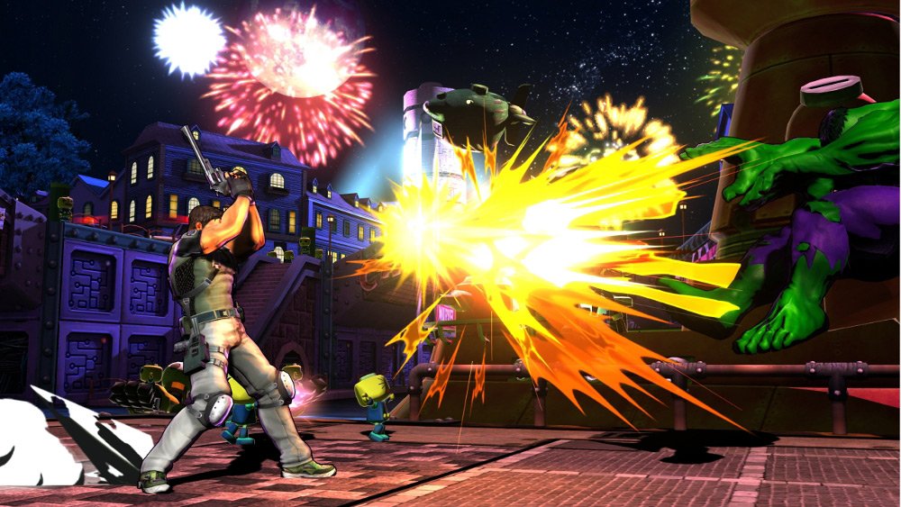
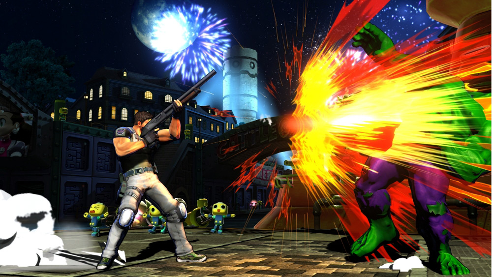
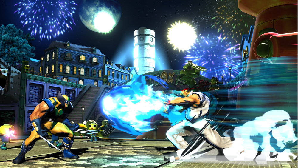
From the look of it, MvC3 appears to be the flashiest and most exciting of the three. While it’s true that we aren’t being shown too much here, the art style and some mechanics have been revealed. The first thing to point out is that at first glance, MvC3 isn’t going to be a carbon copy of Tatsunoko v Capcom (Wii), which was a title that sought to recreate a similar engine to that of the Vs. Capcom series. The art style resembles that of the Street Fighter IV saga but adds a much glossier, smoother effect to character design. This results in a darker, yet still vibrant feeling present in both fighters and environment.
We can also see that the fighting will be the most over-the-top yet, with crazy emphasis on each hit along with even more flash to specials. It would have been nice to see how characters moved, like how high they jump or dash, in order to compare it to the engine of its predecessor. There is an incredible amount of detail and activity going on with every attack and, from whats being shown, it looks like MvC3 has potential to be the most engaging and visual fighter yet. Lets just hope Capcom can make every change for the best and give us a better idea of how all the gameplay elements will unfold. Stay tuned for further coverage of Marvel vs. Capcom 3: Fate of Two Worlds.
Links: Capcom Blog
Related: Marvel vs. Capcom 3 Announced