Motorola Devour For Verizon Wireless (Review)
The Hardware
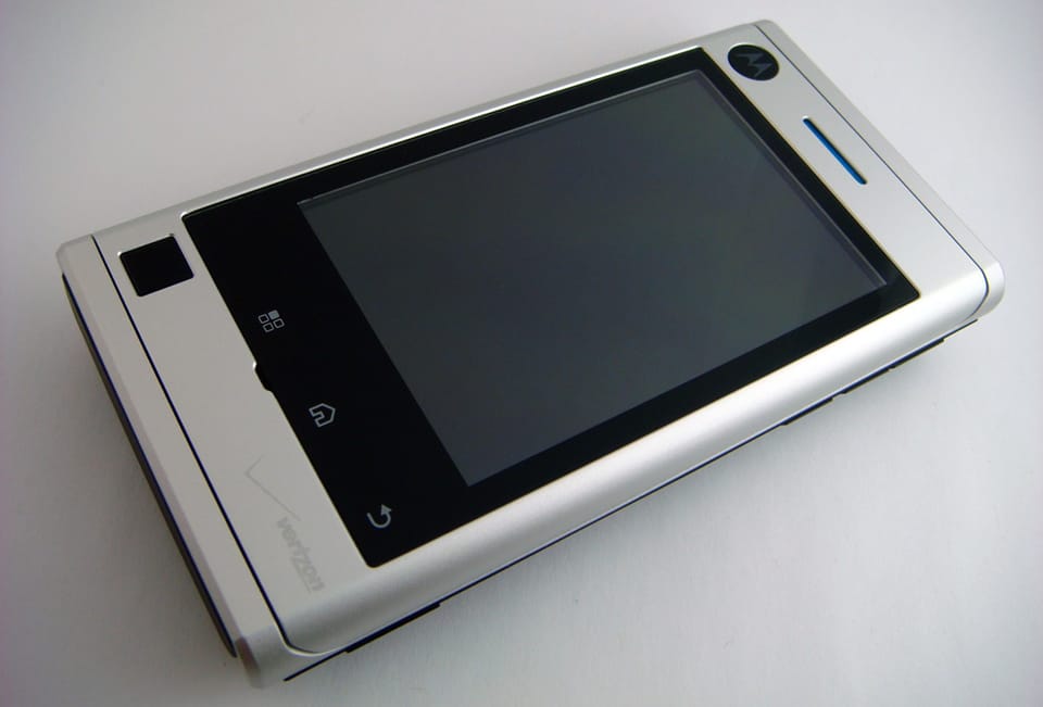
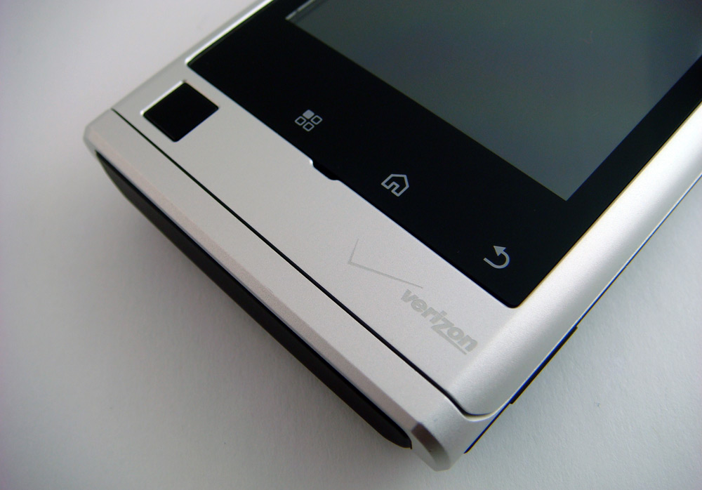
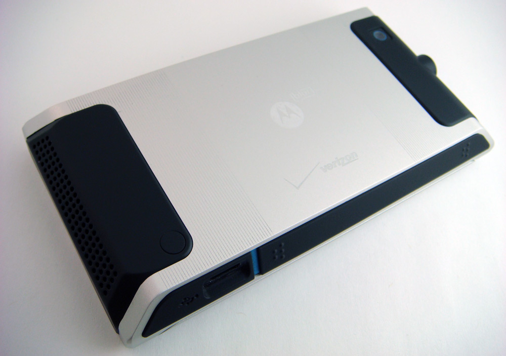
Much like last year’s Motorola Droid, the Devour is also built like a tank. While not as robust, it doesn’t have a cheap lightweight plastic feel. Instead it houses a silver coated heavy aluminum encasement with black rubberized keys for contrast. The slide out design, which reveals the keyboard, isn’t new either. There’s a flush power/unlock button on the top, while a camera shutter, voice command key, and volume rocker are on the right side. The front side features an oddly positioned square trackpad off to the bottom left. A row of three touch-enabled buttons offer instant access to the Menu, Home, and Back commands. It lacks a dedicated search command, which is now heavily featured on most smartphones. As for the trackpad, it occasional comes in handy for some finicky one-handed use, but is unnecessary for the most part.

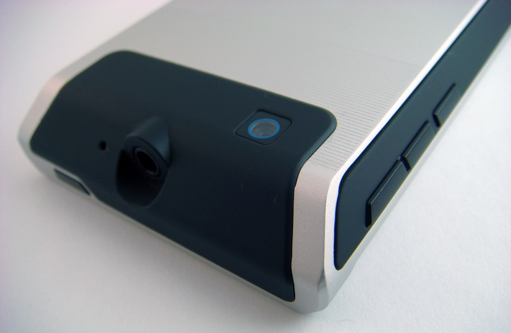
Aside from those features, there’s an odd side access door on the left for removing battery pack besides a microUSB port for charging and data transfer. The 3 megapixel camera, which lacks a complementary flash, resides on the back side. A standard 3.5 mm headphone jack is, thankfully, featured on the top and the bottom of the phone has perforations for a speaker. There’s noting unique, refreshing, or outstanding about the design, but it gets the job done.
The Display
The 3.1 inch 480-by-320 pixel LCD display isn’t particularly outstanding. The screen recedes into the casing with a large black border surrounding it. Unfortunately, those characteristics makes the screen seem even smaller and that’s not even to mention the 4.3 inch displays on phones such as the EVO 4G and Droid X. Viewing angles aren’t great and neither is outdoor viewing. It’s a step up from widely available feature phones, but isn’t comparable to the displays on the latest generation of smartphones. The colors aren’t as rich as they should be and photos also appear washed out.
The Keyboard
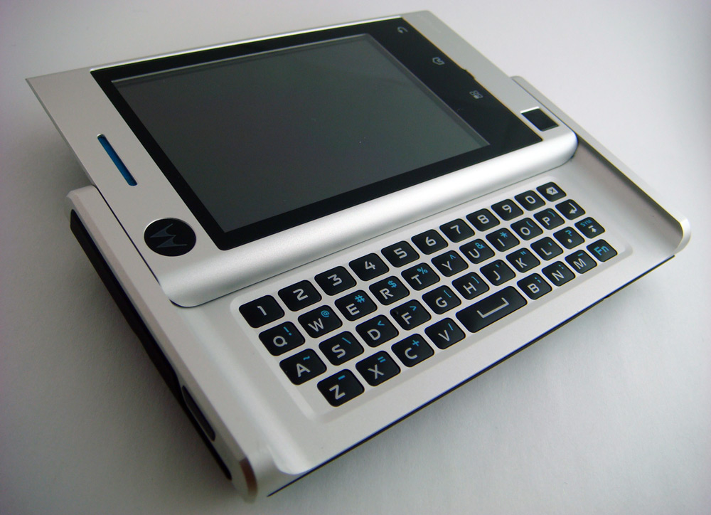
Although I was a huge fan of physical keyboards back when smartphones were still a rarity, I’ve since become comfortable with touch-screen ones. The iPhone probably set the standard for building robust virtual keyboards and as a result, most smartphones have a decent competing one. And with technologies such as Swype, physical keyboards are slowly becoming unnecessary for mobile devices. Thankfully, the physical keyboard on the Devour is much-needed due to a poorly implemented virtual one. It’s a step up from the Motorola Droid, which had flat keys with minimal spacing separation. However, in the process, Motorola did away with a directional-pad. Instead, they expect users to reach towards the touch-sensitive trackpad for navigating. The package works, but it isn’t nearly an ideal configuration.
The Operating System
The Devour runs on Android v1.6, which is a major step behind the latest set of smartphones running Android 2.1 and those beginning to get v2.2. While Motorola hopes to improve the native Android experience with MotoBlur, much like the AT&T Backflip, the custom overlay destroys the experience. Although it adds some social networking integration and brings a set of widgets to the home screens, the interface is slow and somewhat of a nuisance. It’s not nearly as responsive as an Apple iPhone’s OS. New Devour users probably won’t feel the sluggishness too much until they get their hands on a newer device such as the EVO 4G or Droid X. Even the accelerometer fails to respond promptly. Another problem ensured with the proximity sensor which wouldn’t turn off the display, resulting in accidental presses when held up to my ear. And in regards to potential upgrades to Android 2.0, 2.1, or 2.2, chances are slim. While smartphones should be future proof to a certain extent due to software updates, these early generation devices aren’t.
Applications and Widgets
While I expected the same experience that I had on the Motorola Droid with this Devour, I ran into some interesting issues. Often running the same applications that worked on the Droid would freeze or crash on the Devour. Even a factory reset didn’t solve the problem. The screen is also a bit too small for a smartphone. While 4.3 inch screens are a bit too large, something in between is an appropriate size. However, I should mention that I did appreciate the basic Facebook and Twitter integration. It helps average users access those services, however power users should download the full-fledged apps for those services from the Android Marketplace. Unfortunately, it’s not possible to uninstall pre-loaded social networking apps leading to duplicated functionality, however it’s not too difficult to ignore.
The Camera
The Devour sports a 3 megapixel camera on the back. And yes, that’s not up to par with today’s generation of smartphones. The iPhone 4 sports a 5 megapixel sensor while the Droid X has an 8 megapixel camera. The camera app takes a few seconds to load being far from instantaneous. There’s no LED flash to accompany the camera and that’s a shame since it doesn’t perform well in low-light situations to begin with. Images are grainy and due to a lack of auto-focus, images don’t exactly look sharp. While I’ve yet to see any smartphone camera beat the quality of a decent point-and-shoot, devices such as the HTC EVO 4G are a reasonable alternative. However, the same can’t be said for the Devour. You simply don’t want to be taking photos with this phone.
The Battery
A phone in 2010 should last through a least a day’s worth of use. Feature phones from just a few years ago often made it through a few days without needing a recharge. However, that’s not the case for smartphones. With always-on 3G, WiFi chips, fast processors, Bluetooth, and apps, these new phones can’t compare. While devices such as the iPhone 4 have drastically improved on battery life, the Devour fails to last through a day. Even with managing usage and enabled features wisely, it still runs out of juice quickly. For instance, with the display dimmed, GPS and WiFi turned off, and listening to music while browsing the web, battery drops to 50% in just an hour. For those that plan to use this phone through out the day, it’s probably in your best interest to keep a charger at home, at work, and buy a car one too. If you have to charge your device more than twice a day, it’s not practical.
The Bottom Line
When it comes down considering this phone, there’s one unfortunate conclusion: don’t buy it. The Devour isn’t necessarily a bad phone, but there are simply other devices that are better. Sure, the Devour goes for just $80 with two-year contract while the Droid X is $200, more than twice the price. However the monthly voice and data plan rates remain the same with either phone. In a two-year period with the cheapest calling and texting plans, the Devour bill will stack up to around $1880 while the Droid X reaches $2000. When looking at it from a long-term perspective, it make sense to invest in the latter, a device that has a longer lifespan and offers more features. Let’s not forget that the Droid X will receive major software updates such as Android v2.2, while the Devour won’t. And that’s exactly the problem with smartphones, it’s always a bad idea to buy a bad one. In this case, the choice is clear. The Droid X is Verizon’s best offering and it’s the phone you should buy. And if that huge screen is too big for you, even the HTC Droid Incredible or the upcoming Samsung Fascinate (Galaxy S) is a better option.
Buy: Motorola Devour for FREE on Amazon
Links: VerizonWireless.com Motorola Devour