In Photos: Nokia E7
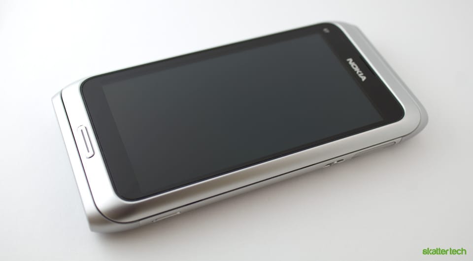
At CTIA Wireless 2011, the folks at Nokia handed me their latest E7 smart phone. The device will debut in the United States and United Kingdom next month. The E7 runs on Symbian^3 although the just-announced Nokia Astound (C7) smart phone for T-Mobile features Symbian^3.1.
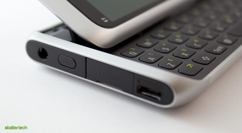
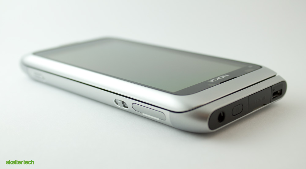
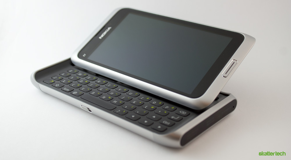
As someone who honestly has not spent enough time with the Symbian OS, I am solely going to focus on the build quality and the hardware hidden inside. For starters, this phone feels expensive and incredibly robust the second you pick one up. It definitely has a more solid design than the plastic framework of a HTC Thuderbolt or even the glass faces of the Apple iPhone 4.
Nokia E7 Specifications:
- Screen: 4 inch capacitive 16:9 nHD (640 x 360 pixels) AMOLED
- Operating System: Symbian^3
- Internal Storage: 16 GB
- Wireless: WiFi 802.11 b/g/n and Bluetooth 3.0
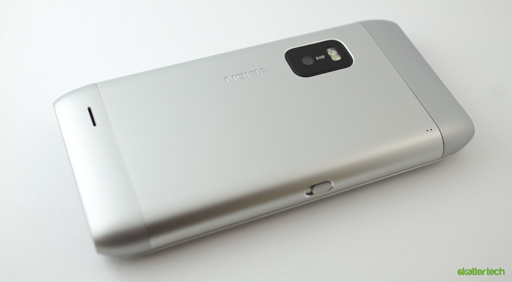
- Front Camera: 8 megapixel rear with dual flash, 720p video
- Rear Camera: 0.3 megapixel (VGA) for video calls
- Connectivity: USB 2.0, HDMI, and 3.5 mm headphone jack
- Keyboard: back-lit full QWERTY and virtual keyboard
- Sensors: accelerometer, light, magnetometer, and proximity
- Other: FM radio, GPS
- Battery: 1200 mAh Li-Ion, 9 hours talk or 430 hours standby (GSM)
- Body Colors: dark grey, silver white, blue, green, and orange
- Size: 123.7 x 62.4 x 13.6 mm
- Weight (with battery): 176 grams
Some Early Thoughts
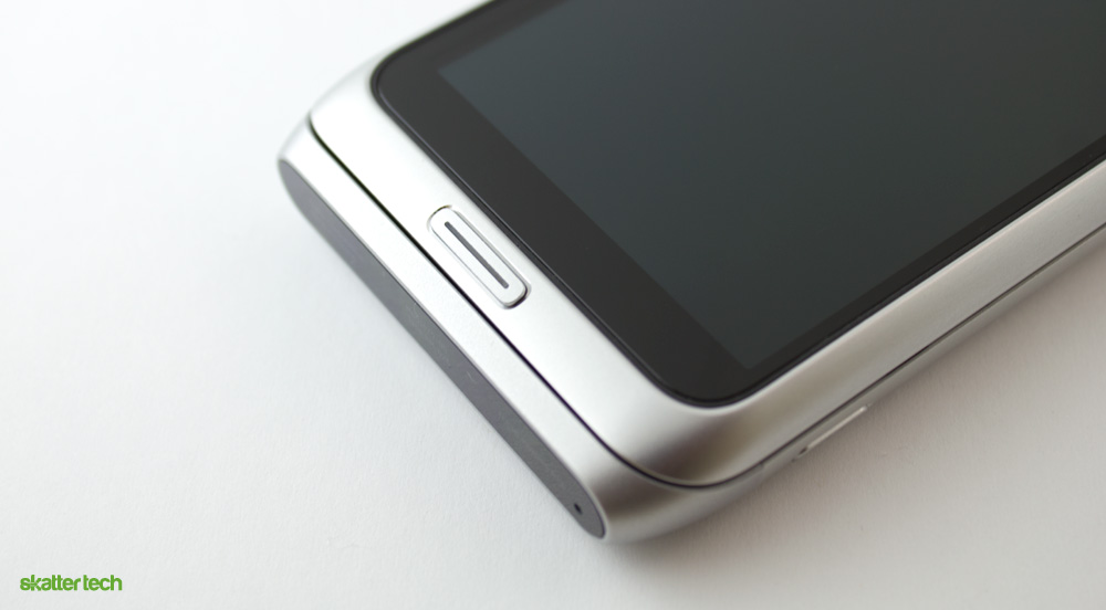
We once stated that the original Motorola Droid was built like a tank and I can not find a better way to describe the Nokia E7. The anodized aluminum body does not flex even the slightest amount. For a device with a slide-out keyboard that pops into a laptop-like form factor, the E7 is impressively compressed into a streamlined design. While most people quickly realize that devices such as the HTC Arrive packs a sliding mechanism, it is nearly impossible to tell with Nokia engineering. Unfortunately, the curved edges also make it difficult to open the smart phone.
The 8 megapixel camera sounds great, but it lacks one very important feature: auto focus. Camera phone images are blurry enough and the fixed lens does not help. It also makes it nearly impossible to scan barcodes, QR codes, or text. Fortunately, the AMOLED display kept me interested. Nokia uses a Clear Black Display which offers richer colors, more brightness, and darker blacks. I also found that it was significantly easier to read text under direct sunlight with the E7 compared to the EVO 4G.
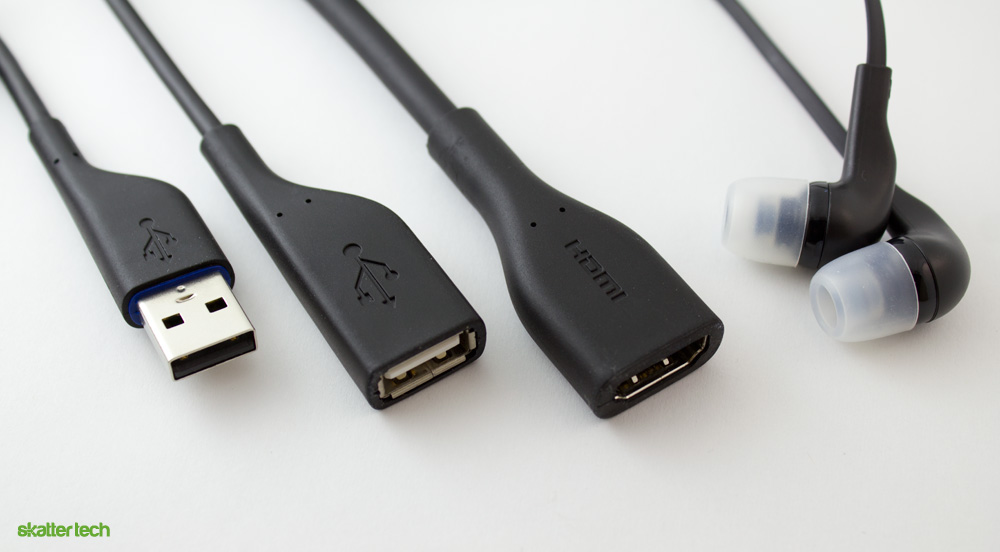
Nokia also includes a handful of accessories with the smart phone like most of their products. These include a wall charger, a microUSB cable, a stereo headset, a HDMI cable, and a USB adapter for flash drives. For now, I do not have much more to share. While the built quality was quite impressive, I still have some mixed feelings about the operating system and a few thoughts to share regarding the outdated hardware. Expect a thorough review in the coming weeks.
Buy: $659 on Amazon
Links: Nokia E7 Product Page