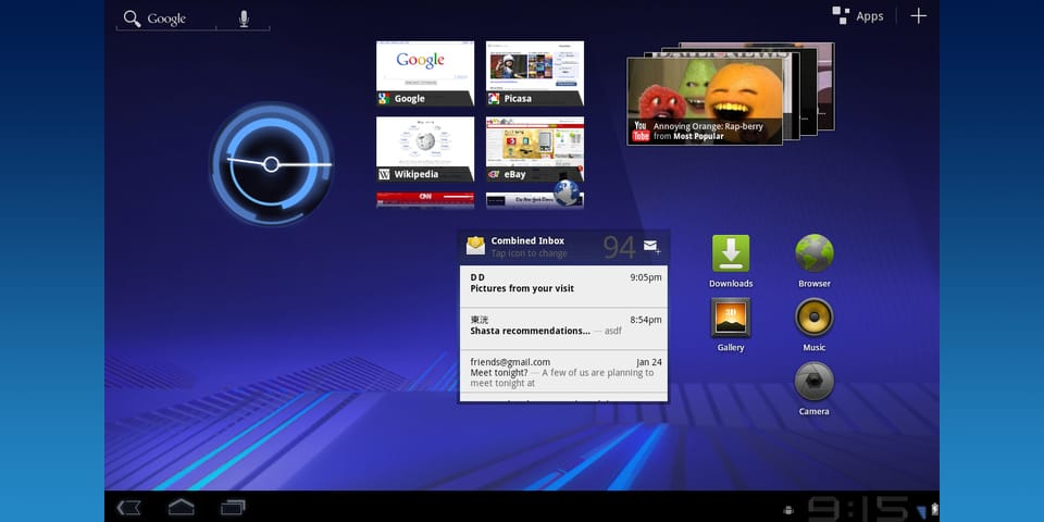
I had a chance to spend about a week with the brand new Motorola Xoom and I was rather impressed with the new operating system. Android 3.0 Honeycomb offers a refreshing interface and many people are not aware the improvements it has over the older smart phone OS. For those of you who have yet to get their hands on one of these tablets, I decided demo five new features that makes the fresh out of the oven Honeycomb OS great for the tablet form factor:
Home Screen Interface
The new Android 3.0 code-name Honeycomb OS features five home screens for widgets and application icons. It starts out on the center home screen and users can swipe to either the left or right to access the others. A new space themed Tron inspired interface is apparent throughout the entire system, not just the home screen. Google has hinted that the next Android upgrade for smart phones will inherit the new look. A handful of interactive widgets come pre-installed. Organizing items on the home screens is easy and intuitive with great visuals.
Voice Actions
Google may have initially introduced this feature about a year ago at their I/O 2010 conference, but the feature still impresses. Without having to program or train your device, the cloud-based Voice Actions perform tasks based on your command. Users can initiate music playback, start GPS navigation, send emails, set alarms, visit webpages, or search the internet with simple commands.
New Bundled Apps
The new tablet-optimized Honeycomb OS also brings a set of quality pre-installed application that take advantage of the large screen size. Most of these offered more features and were more responsive than the iOS 4.x counterparts on the original iPad in my opinion.
- Google Books – 3D carousel view, two side-by-side page view
- Web Browser – tabbed interface, Adobe Flash support soon
- Calendar – flexible and supports multiple calendars
- Camera – a new layout for easy access to settings
- Clock – a full screen clock which also shows set alarm time
- Contacts – a convenient two-pane view
- Gallery – stacks represent folders of photos and videos
- Gmail – two-panes, snippets show previews of messages
- Google Maps – 3D buildings and two finger zoom and rotate
- Movie Studio – edit and publish videos on the go
- Music – cover flow interface and views for Albums/Artists
- Settings – reorganized layout for easy customizing
- Talk – supports video chat and multiple conversations
- YouTube – 3D wall for featured content
Multitasking and Notifications
Switching between apps is easier than ever. While users generally had to hold down the home key on smart phones, there is now a dedicated app switching icon at the lower left of Android 3.0. It displays the five most recent used applications. Notifications now appear in the lower right task bar by the clock. It is easy to dismiss or react to a notification. A quick settings panel is also within reach at all times for access to WiFi, brightness, screen lock, and other options.
Web Marketplace and Chrome to Phone
The new web-based Android Marketplace is compatible with Honeycomb tablets. It is easy to install new apps to your tablet even if you are not in the same room. Of course, no cable required. It works as long as your tablet is online with either 3G, 4G, or WiFi. The Chrome to Phone extension also works perfectly with the Motorola Xoom tablet. I pushed webpages, maps, videos, and other content over to the tablet with a single click from my laptop.
Impressive. Thanks for this post.
Impressive, impressive indeed. Why have all other reviews been so shallow? Android has a lot of potential, I now see.
I really applaud you for creating a great detailed demo about the Honeycomb OS, I tried finding non-bias information about the Xoom on Pcmag, Engadget, among others and fail short. so many blogs write articles praising the Ipad 2 unjustifiably by not properly telling the consumers about all the functionality of the Xoom, something Motorola and Google need to work on.. In Thanks again!
Thanks Stan,
The iPad was a great tablet, but that was a year ago. The Xoom has a lot of potential. I am disappointed that they screwed the ball on the 4G module debacle, microSD support until the next update, and regarding Adobe Flash. However, the platform is better suited for tablets in my opinion than the current version of iOS, which is essentially an enlarged version of the original operating system made for iPhone and iPod Touch.
We have an in depth review of the Xoom coming up and I’ll be sharing my thoughts on the iPad 2 shortly. Stay tuned.
Thanks for your support.
Another nice feature is the full screen option in the web browser. When its on, if you touch the edge of the screen a half circle pops up around your thumb with controls like forward, back, search, etc.
Also as you type a new search the results pops right above the keyboard, you know where thumbs are, and they are listed from bottom to top in likely matches. Its really convenient and makes q lot of sense.
The Specs are incredible, why do Apple Sheep not understand Better Specs means better device they are so into the experience, sure the hardware and software on Xoom is not exactly matching up now but once the upgrades are completed within the next 24 months watch out for Android to Dominate, us Techno Geeks will Rule, anything that is easy to use is a TOY, Real Tech Fans like things we can modify and somewhat difficult to use.
The specs are ‘incredible’? Within 24 months look for it to dominate? I’m sorry but one could say that about any single device or platform, including any tablet currently on the market. Commentators said the exact same thing 2 years ago about Netbooks; where are they now?Your comment leads makes you like like as much of an Android Fanboy, as those of the Apple Sheep that praise that platform without criticism.
Best review on Honeycomb I have ever seen!!! That is what a review should do – telling users what features matter the most.
Does anyone know if honeycomb can do multi tasking? in other words if I want to have someone write an app for me that requires a few apps running simultaneously, will the OS allow for multi-tasking?
I’m not sure I understand your question completely. But here’s my answer anyways. Android 2.0+ and 3.0+ do support multitasking. You can’t see two apps at once, but you can play have multiple processes happening continuously. That means play music in Pandora, switch to Google Books to read a page, switch to Email to write a few sentences, and return to home screen. If you use the multi-task button to switch to Google Books or Email, it will be in the exact state you left off. It was simply “minimized” or “hidden” from view. Oh and Pandora would still be playing in the task bar of course.
This is a really great review. Got me excited about the Xoom all over again. Only new feature it needed to showcase that it didn’t was Google video chat, but overall, what all the other reviews missed – short and sweet looks at what matters. Thanks!
Xoom is a superpowerful tablet computer – everything you want in one black sleek aluminum case. I love web-browsing on Xoom, movies look like movie theater on the go, cameras are great, Honeycomb works almost flawless and it’s just DEBUTED. Xoom = WOW.
ipad2 has *3* specs on a par with Xoom, ALL other its specs, including one of 2 key factors of functionality and efficiency – RAM (512Mb) – are WORSE than Xoom’s ones. I want FLASH.
I will buy 32Gb SD card to make my Xoom 4G 64Gb!
Thank you for the post, Honeycomb is awesome. I love Android.
everyone has told me that iPad is the best and to get the new one. no one i speak to knows much about android. they all say apple has the best tablet. i went to apple store and played with ipad many times. my friend waited in line and got ipad 2 and it looks very nice too.
however once i see how cool xoom looks, i really want this instead. i tried the new ipad 2 for sometime and it does not have any of the things you showed here. xoom is very much more advance and this video is great for explaining that to me. thanks
Would have loved to see a demonstration of streaming from services such as Hulu+ and Netflix.
Oh wait, not available on the Xoom due to the fact that nVidia left out the hardware based video decoding capability required to play copy protected media. Oh well, saved them about $2.30 per chip so I guess that is money well saved.
That’s just sad and disappointing if true. Do you have any articles about it? I would like to read a bit more about the issue. If it is the case, I definitely would not even consider buying a WiFi-only Xoom. Especially since its a hardware flaw that can not be fixed. Netflix and Hulu+ are two services I have been waiting for eagerly.