WordPress 3.2: What To Expect

For those keeping tabs, WordPress 3.1 made a debut earlier this year in February bringing several new features including internal linking with the post editor, an admin bar, post formats, and a handful of other additions. Just a few months later, WordPress 3.2 is already warming up for a debut at the end of June. This version brings plenty of enhancements to the Dashboard, a distraction-free writer, and ships with a new default “Twenty Eleven” theme.
A New Dashboard

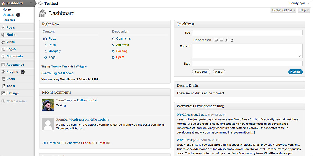
Long time users may remember the several major Dashboard overhauls that WordPress went through as made its way from version 1.0 to where we are today. The upcoming changes, which focus on a more efficient style, are fortunately not nearly as drastic. The menus in the left column cut down on wasted space while the new header and footer have a smaller profile too. The notable “New Post” button drop down at the top right is gone and the same functionality will appear in the admin bar.
WordPress 3.2 also ditches Internet Explorer 6 support and encourages users running old browsers to upgrade to better ones. Those working on netbooks with low-resolution displays will probably appreciate the space conservative design changes. A few back-end performance upgrades will make using the Dashboard faster for everyone too.
Distraction Free Writer

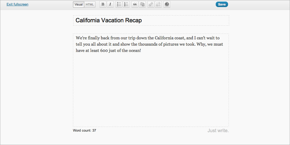
WordPress has had a “full screen” mode for ages in the post editor, but it was never too useful. Fonts were too small and the limited functionality did not help either. The upcoming upgrade replaces that feature with a minimalistic distraction-free writer. While typing in this mode, all toolbars disappear leaving only text on the screen. Moving your mouse brings the most used toolbar items back to focus along with other bits of information such as the word count. Inserting images and embedding content is also possible. The distraction-free writer works with both the visual editor and the HTML editor too. And yes, you can save without having to switch back.
Twenty Eleven Theme
WordPress shipped with the famous Kubrick theme for years until a new theme named Twenty Ten made an appearance last year. The next out of the box default theme is Twenty Eleven and it features an incredibly large header image much like its predecessors. If keeping in line with the new trend, the folks at WordPress might even have another Twenty Twelve theme around this time next year.
The clean design is something that many will definitely appreciate — it apparently comes in a light and dark skin too. Twenty Eleven also features an animated gallery and support for Tumblr-like post formats. The lightweight footprint for snappy performance is also a plus. The most important aspect is probably the adaptation of HTML5 and CSS3 since these standards are finally becoming fairly compatible with most popular web browsers. The Twenty Eleven theme will likely also serve as a template for thousands of developers creating new themes.
Links: WordPress