Opera 11.50 Introduces A New Interface And Other Neat Features

With Mozilla Firefox and Google Chrome leading the pack of browsers, other competitors such as Opera often go forgotten. While the total market share of every version of this particular browser is smaller than just the new Microsoft Internet Explorer 9 alone, it still has a lot to offer. The latest 11.50 update brings a brand new interface, performance improvements, and several other new features.
Speed Dial Enhancements
http://www.youtube.com/watch?v=BjYQRru46-I&hd=1
The speed dial feature on the new tab page has long offered quick access to favorite websites and it can now do even more. Opera extensions can now tie into these to provide fresh dynamic information. For instance a news website could offer a glimpse at a new headline or a weather website can show the most recent forecasts. These are a bit like widgets, but contained within a thumbnail. Opera no longer limits the number of speed dials and the interface automatically takes advantage of the size of your window. This is great for those with large high-resolution screens since they can see bigger previews and more items in a single glance. A slider allows for manual resizing and users can drag-and-drop to rearrange speed dials as always.
Password Sync
http://youtu.be/LLbsXxQBEj8?hd=1
Opera Link makes it possible to keep bookmarks, history, speed dials, notes, and search engines synchronized across multiple machines. This is great for those who may have a desktop at home, a laptop for the go, and another computer at work. While this feature is great, there was one missing piece to the puzzle: passwords. Opera 11.50 makes this possible with just a click of a check box. Google Chrome already offers extension syncing and I am sure Opera will do the same in another future release.
A New Interface

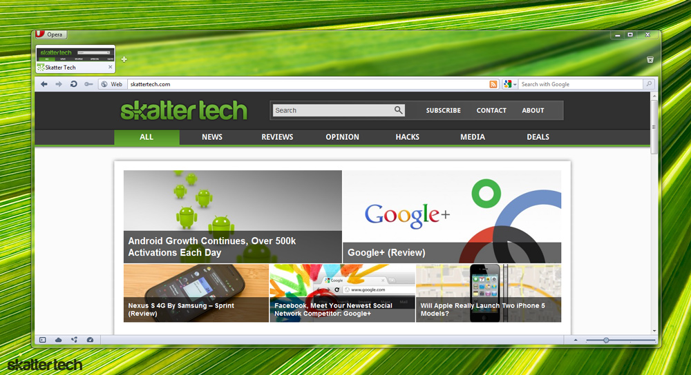
Opera first did away with the traditional file menu bar as many programs have last year. The company continues to simply the browser with a new cleaner streamlined layout. Both the Mac OS X and Windows 7 editions feel like native interfaces without any odd deviations. My only complain is probably the status bar at the bottom which remains visible by default — Chrome, Firefox, and Internet Explorer have done away with it entirely.
While tabs were once revolutionary for making web browsing more organized, things are beginning to get out of hand again as people spend more time in a browser. Opera takes a leap again with the addition of “tab stacking” which lets users essentially group sets of tabs. Expanding a stack reveals all the tabs inside and users can drag to take one out or add more in. I definitely think this is a feature I would put to use, but I would have to say that Firefox probably has a better implementation with ‘panorama‘ for a visual expose view.
Other Additions
Those are not the only new features, Opera now runs on a new Presto 2.9 rendering engine meaning faster loading of web pages. Visual mouse gestures make it possible to navigate with movements of your mouse. Of course, other great features for power users include a built-in an email client, a bit torrent client, IRC chat, and even a web server. There is a new version of the Dragonfly debugger for web developers and better support for HTML5 too.
I usually have Opera installed for occasional use but have never managed make a full switch over for more than a few hours. The browser still lacks a comparable selection of add-ons and I it is disappointing to find that a haywire webpage can still bring down the entire browser.
Links: Opera