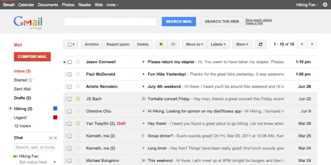
For quite a few years now I have been constantly complaining that Gmail is the ugliest mail client I have ever encountered. It is cluttered, confusing, and the overall design just lacks the elegance and consistency of other popular websites such as Hotmail. For a while I even refused to use Gmail because of this, but as it continued to grow in popularity, I jumped on board.
Today, I am proud to announce all of this is finally coming to an end. You may have noticed multiple Google services have been undergoing design changes to match the modern look of Google+. First was Google search, then Google Calendar, and now it is Gmail’s turn. So far, it is looking pretty good. The Gmail team writes:
If you poke around you’ll hopefully find a lot to like and a much cleaner, modern look but also few rough edges. In particular, some Labs features may look a little strange in the new themes. We plan to fix these issues as we roll out changes in the coming months. You can also expect some updated themes that embody the same design principles but are better suited to working in a dark environment, use a different color palette, or include the illustrations that we know many of you love to see around your inbox.
 It is true. The site is very sleek now. The folks behind Gmail have smoothed out all the gradients beautifully, making for a streamlined look that is much more pleasing to the eye. I also noticed that because of this, it is easier to focus on the contents of an email. The Gmail team also improved the organization of the options bar at the top of the inbox and cleaned up the footer area, which was previously drowning in unnecessary links and information.
My only complaint right now is the large, odd mix of colors. With the blue Search Mail button, red Compose Mail button, gray theme, and multiple label colors, it feels a bit like Fischer-Price chimed in on the color scheme. That said, I am happy Google finally decided to give Gmail a revamp.
The new design is not rolling out just yet. Instead, you can access the preview by going into Themes under Settings and then choosing Preview or Preview (Dense). They are both the same, but the dense version pushes all the content slightly closer together.


I think they’ve used the same layout for at least 5 years, I think the new layout is more functional. Only one thing bothers me, the links to turn on/off chat were removed from the footer, I know it looks more clean but I was used to find them there and turn the off for distraction free environment. Now I have to navigate to the settings. Other than that, I love the new layout too.
I like the new look,but do have to say I also like the old look as well,but I trust you guys and know what changes you make will be good, so in short I’m down….it does look cleaner and it looks like you can put more tabs on it,which would be cool. I like access to more files and options and to even have something were you can store things with out losing them when you take it out of one file, it tends to erase it all together, you know a tab or file that will save information or what ever, a safe file which will save things,kinda like the trash file,but something that would save it more so ,hope I ‘making sense.