

Today, Steven Sinofsky took to the Microsoft Developer Network blog to announce an update on Windows 8. The Explorer, which is the central file manager for the operating system, is getting a major face-lift. For those not familiar, the Explorer has been a part of Windows since version 1.0.
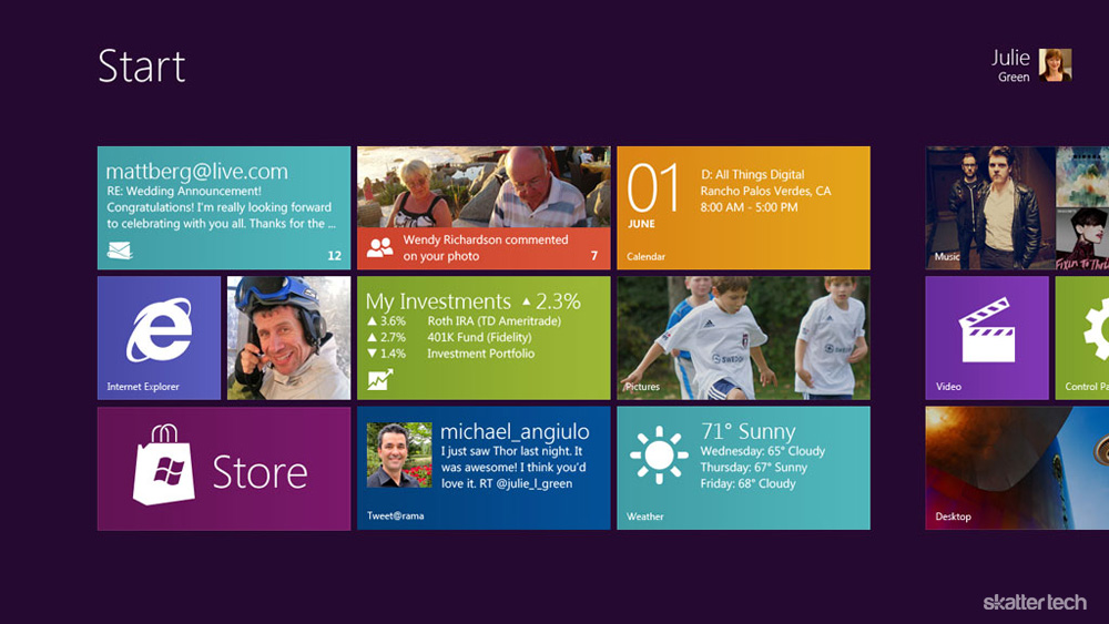
A few months ago, Microsoft unveiled Windows 8 with its new Windows Phone-inspired Metro UI. It looks unlike any other version of Windows before it. With the huge push towards the new interface from the folks up in Redmond, you would think Explorer would follow suit, right? Oddly, the redesign of Explorer sticks with a Windows 7 interface style.
The biggest addition is the ribbon. Microsoft first introduced this in Microsoft Office 2007, which according to them provides a more efficient way to navigate through menus and controls. Though it gets a lot of criticism, especially at debut, I happen to like it for the most part. The ribbon interface tends to take the focus off of content and more on the menu, but it surfaces many options normally underneath layer after layer of navigation.
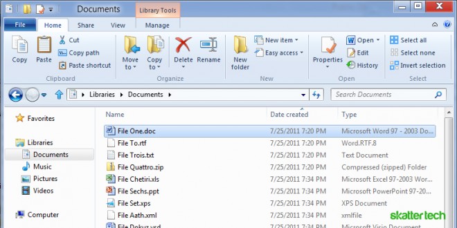
That is exactly the reason why Microsoft is adding the ribbon. Sinofsky writes some of the more specific reasons why:
- Makes it easy to find commands predictably and reliably. Every important file management command could be given a home in the ribbon, and customers would always know where to look for them.
- Takes a similar approach to Office, Microsoft Paint, and Windows Live Essentials, which means that many of our customers will be familiar with the model and not have a lot to learn.
Right now, I am a bit confused. At one point, Microsoft was boasting about the fantastic Metro UI. Everything is supposedly easy to access with the touch or swipe of a finger. Then they come out with this redesigned Explorer, which begs for a mouse.
The company did explain that not every application would be a part of the new Metro UI. This is understandable, considering the vast amount of applications on Windows. But switching between two completely different user interfaces in one operating system is not the solution. Users will not find this beneficial to the experience. While Explorer’s redesign is welcome, one can only hope it is a small piece to a puzzle Microsoft plans on fitting together before Windows 8’s release.


